In this two-part article, we’re exploring different ways of adding depth to your fashion sketches by means of backgrounds. Previously, we discussed how to make use of a grounding line or horizon, and how to insert a plain colored backdrop. Now, we’ll learn about colored gradients, vague backgrounds, and detailed scenery.
(Click on any illustration to view the full-sized image.)
Gradient Backdrop
A more sophisticated option than a solid background is a gradient background. You might choose a lighter and darker version of the same color, so the background will appear shadowed on one side. Or you might choose two different colors, for an ombré effect.
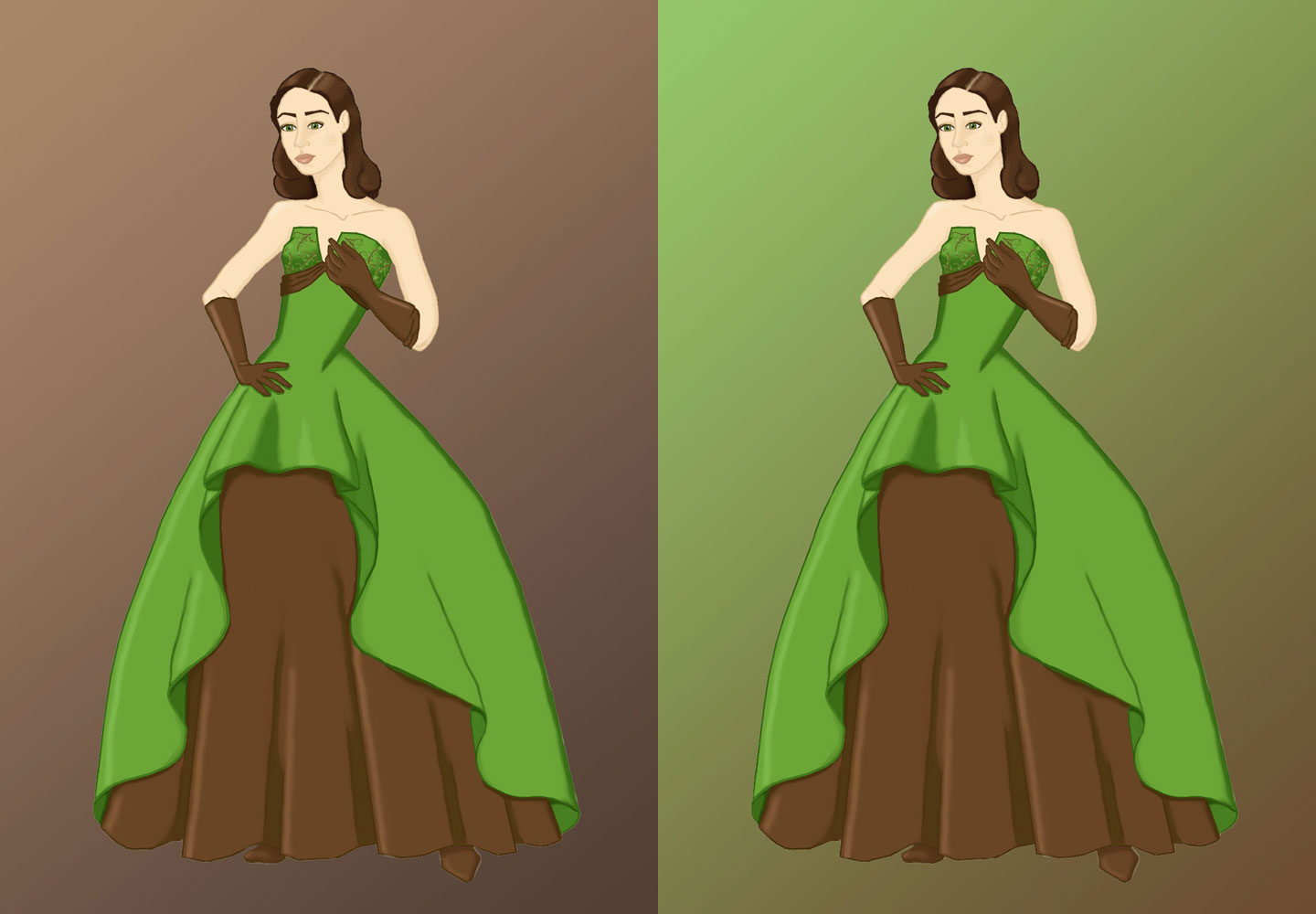
“Brown Apple” ~ 2013
Monotone Color Gradient (left) vs Ombré Gradient (right)
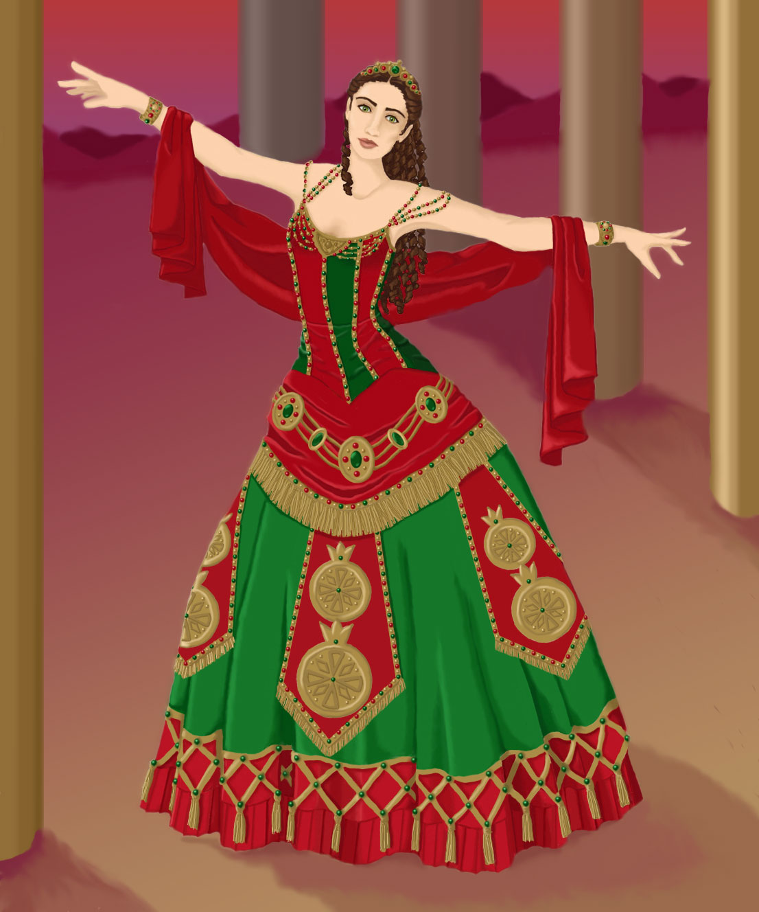
Experiment with color combinations! I like to use one color from the drawing, and a second color that’s opposite on the color wheel. For example, blue and peach, as seen below.

“Victorian Underpinnings” ~ 2013
Complementary Gradient
To fill in the gradient, select the background with the magic wand tool, then switch to the gradient tool and drag it across the image. Play around with the options! You can get different looks depending on where you start and stop dragging the tool. You can adjust the angle of the colors, too, tilting them vertically, horizontally, or diagonally.
You can also choose what kind of gradient you want. There are several to pick from, but I usually use a linear gradient, where the colors blend evenly in a straight line, or a radial gradient, where the colors fade outward from a circle of color.
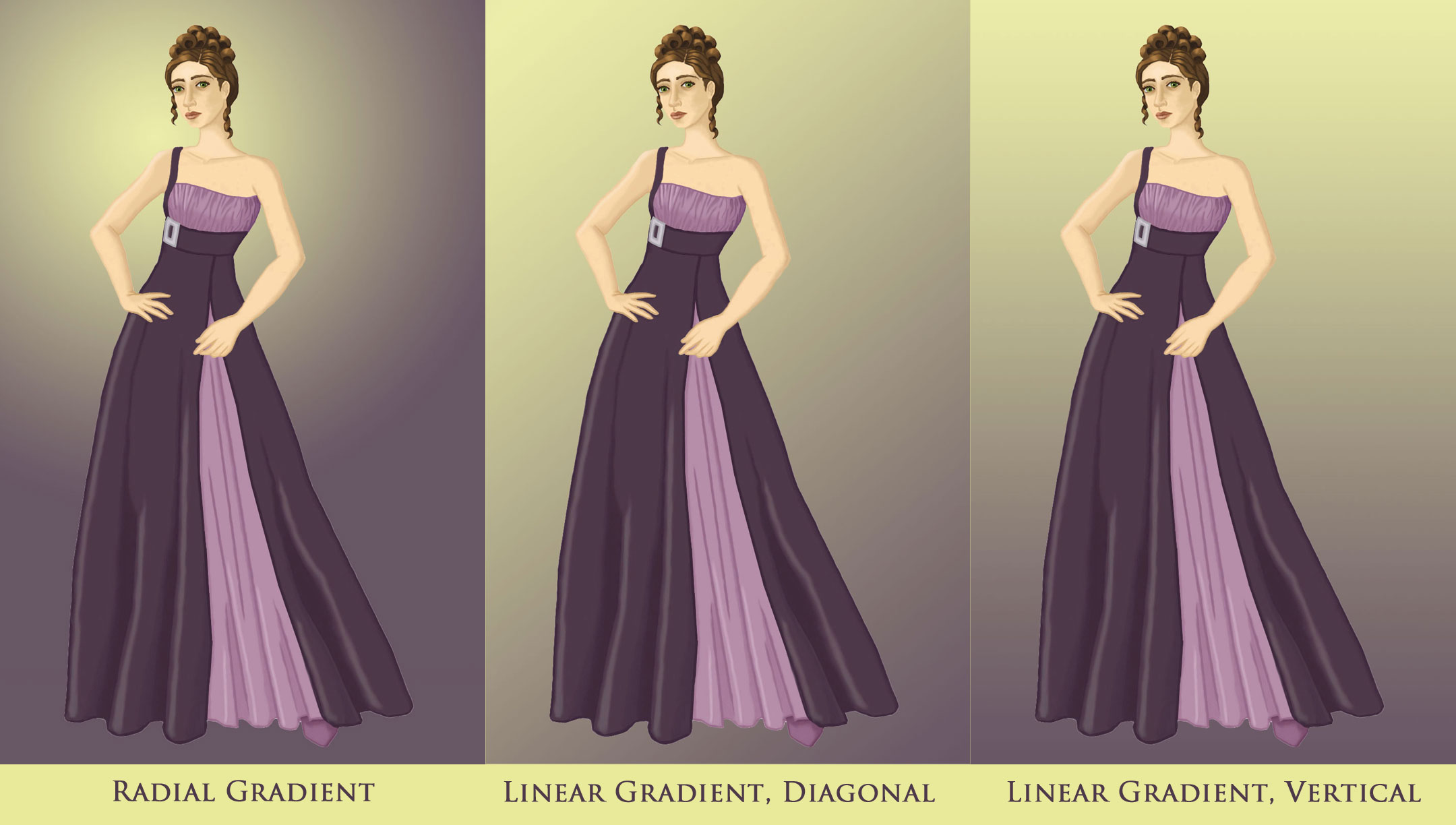
“Aubergine Evening Gown” ~ 2013
Different Angles of Gradients
Gradient Backdrop with a Grounding Line
Another option is to combine a gradient background with a grounding line. (We talked about grounding lines in the first half of this article.) I use this combination a lot, since it’s very easy, yet adds significant dimension to a sketch. If you extend the grounding line from one edge of the drawing to the other, you can fill in the top and bottom gradients separately. This allows you to make the bottom section darker, or cast the light in a different direction, adding further depth to the drawing.
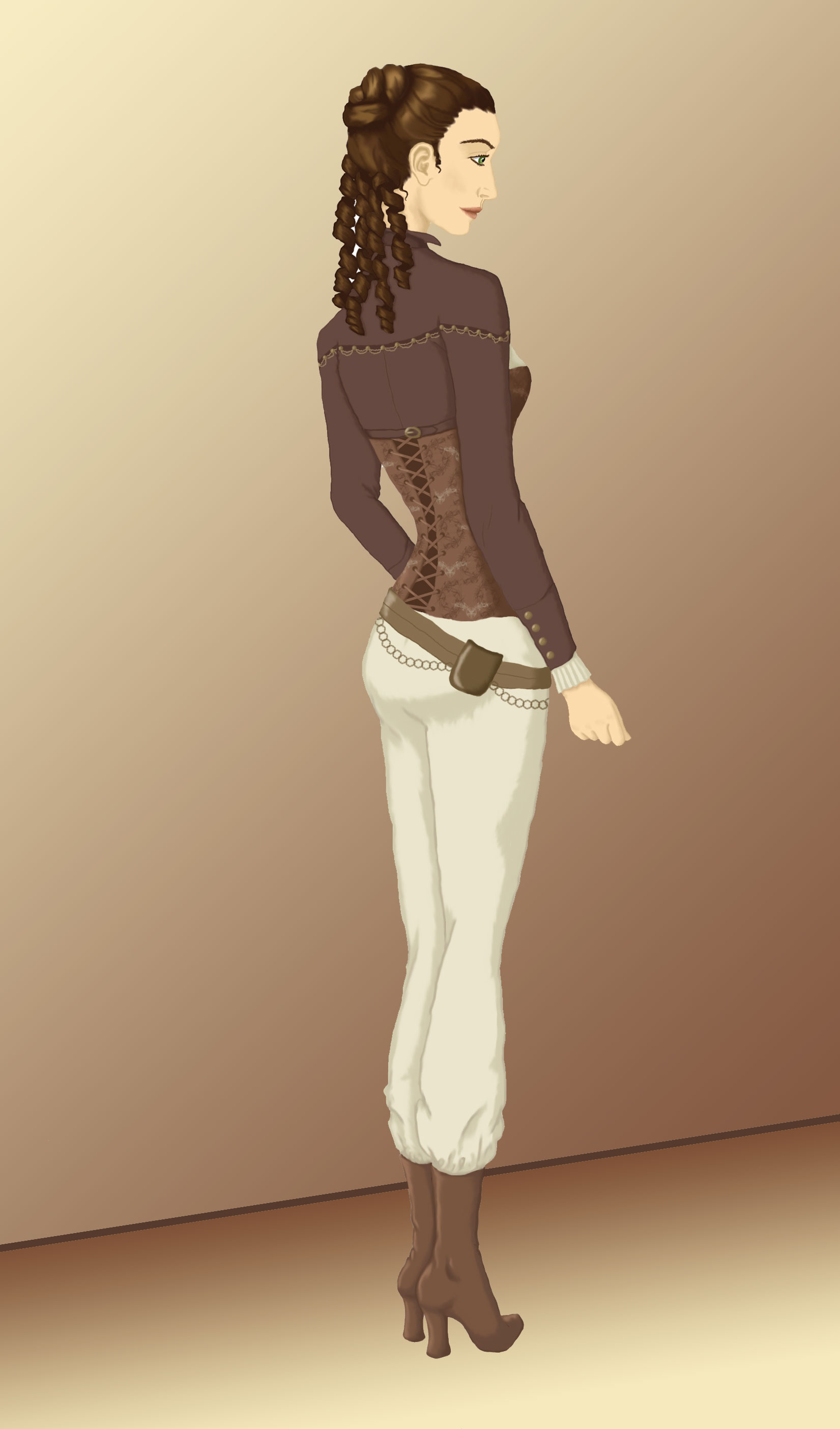
“Steampunk Trousers” ~ 2014
Gradient With a Grounding Line
To get a softer look, reduce the transparency of the gradient before you add it. I like to start with 75% and gradually raise the opacity, depending on how it looks. The change can be surprisingly drastic!
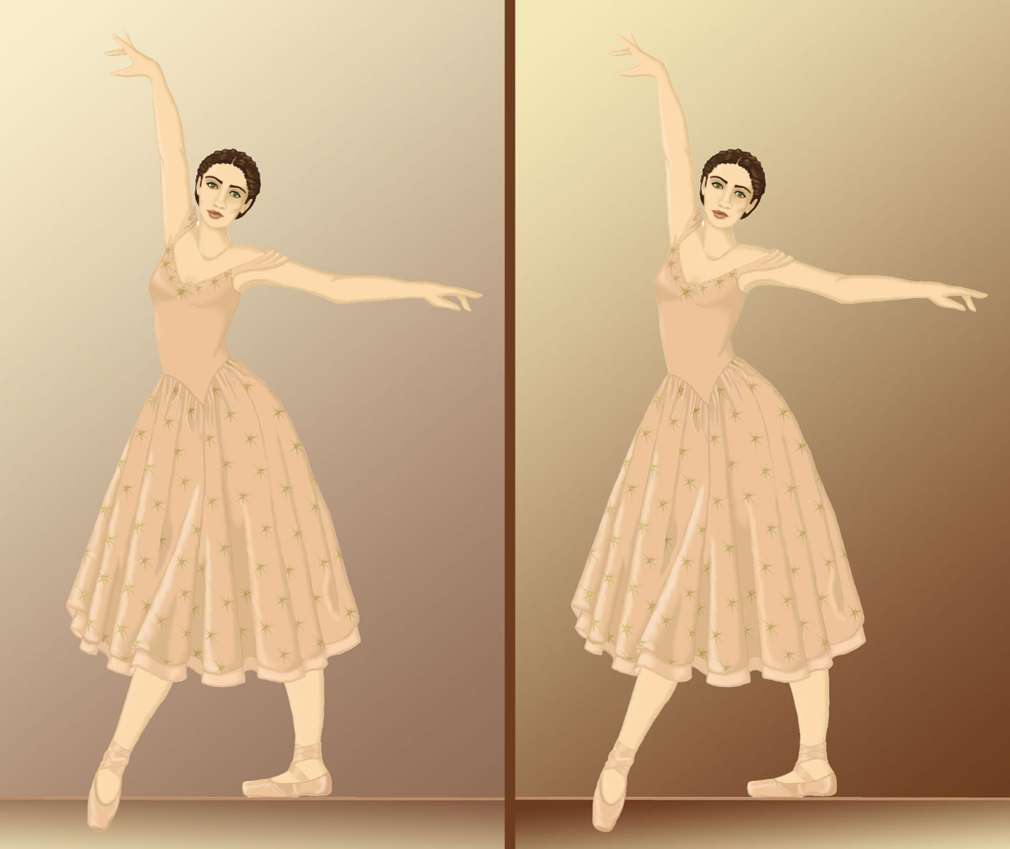
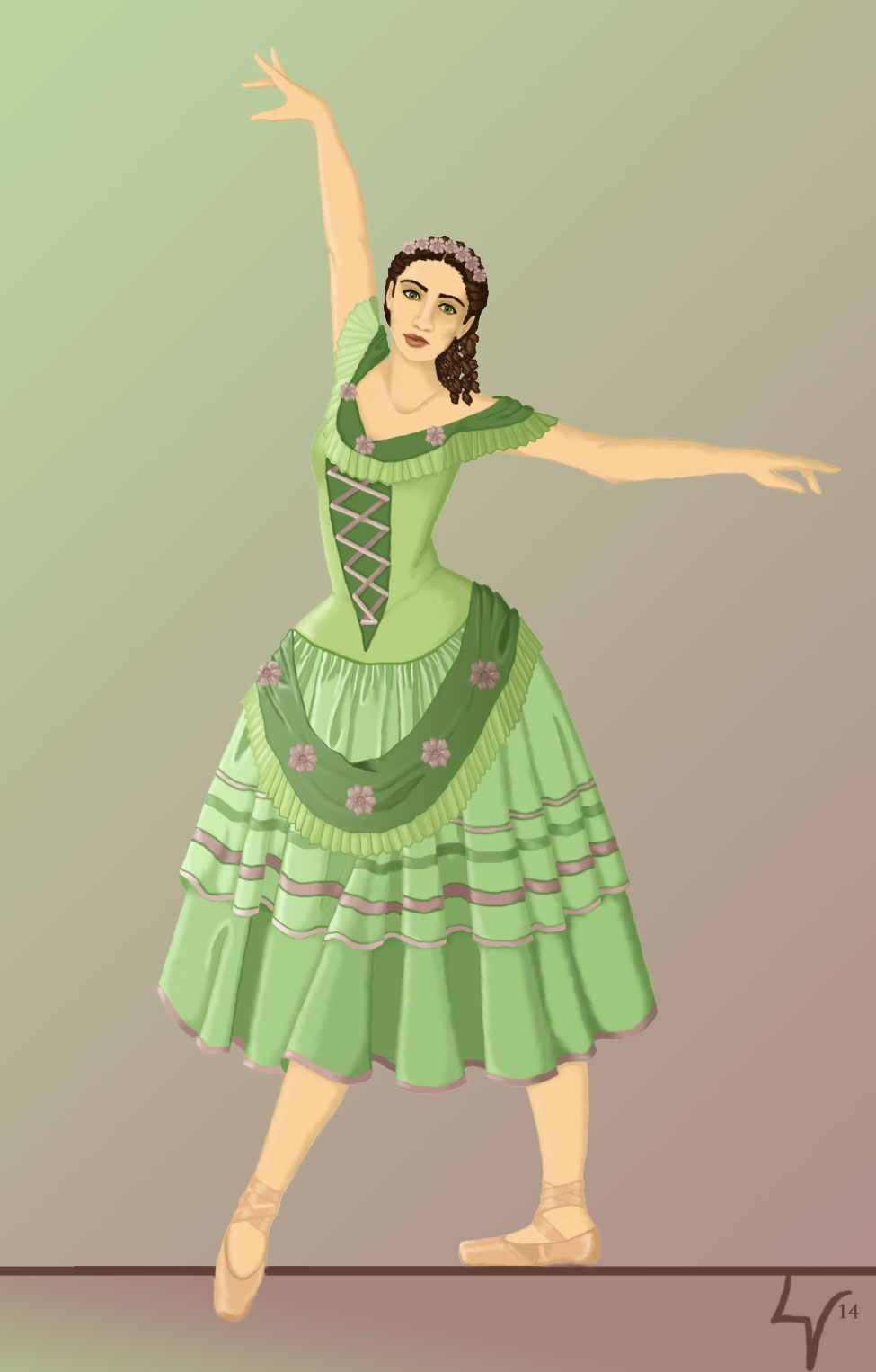
“Peach Ballet” ~ 2013
75% Opacity (left) vs 100% Opacity (right)
Experiment with gradients, trying different angles and color effects. You can even add texture to the background, if you like.
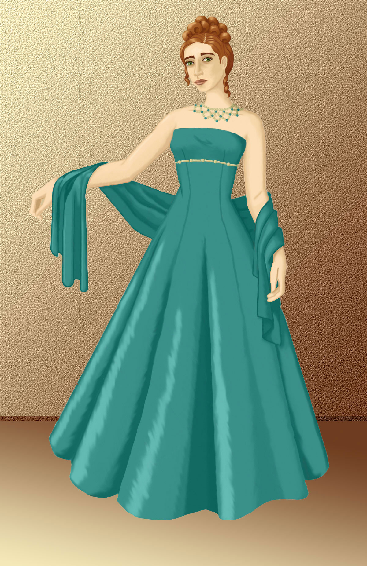
“Teal Ballgown” ~ 2014
Gradient With Texture
Vague Scenery
If you want a background that’s more than just a colored gradient, you can draw the outlines of objects, buildings, people, or a landscape. Don’t spend a lot of time with it, though. The goal here is to give the impression of a larger world, not to draw every detail. For once, it’s okay to be imprecise and unfocused!
It’s easiest to add a background if your model is drawn on a separate layer, so you can create the background on a new layer behind her. But even if this isn’t possible, you can still manage. Here’s how:
-
Create a new layer and draw your background on it. Don’t try to draw around the model—go ahead and sketch the entire background right on top of the model.
-
Once your background is done, switch to the first layer, containing the model.
-
Select the entire blank background, then inverse the selection, so just your model is selected.
-
Hit CTRL-C to copy the model, then CTRL-V to paste a new layer.
-
Shift the layer order, so the new layer is on top.
-
Voila! Your model should now be standing in front of the background scenery.
For extra dimension, draw closer objects in more detail and with stronger colors. The more distant something is, the less defined and more faded it should look. You can use this effect to show a landscape fading into the distance, for example, or the silhouettes of other people in the background.
“Think of Me” ~ 2014
Vague Scenery
Detailed Scenery
For most sketches, fashion or otherwise, you don’t need an intricate background. If you do want one, it’s not as hard as you’d think. Use the same layering technique as before to place the model in front of the background.
Use color and lighting to set the mood of the piece. Dark shades and plenty of shadows can give your drawing a mysterious feel. Light, pastel tints will make it seem more juvenile or lighthearted. A muted color palette will feel more vintage, while brighter colors will look more modern and fresh.
Remember to make the background match the figure, too. A moody backdrop with lots of shadows and murky coloring won’t look right behind a brightly lit drawing of a girl in a pink pinafore. You can make anything work together, but it has to be cohesive. For example, you might add more shadows to drawing of the girl, or tone down her colors to match the background.
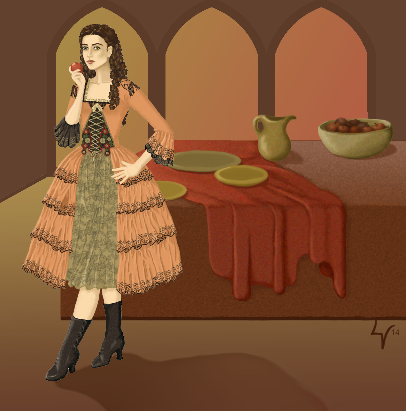
“Aminta” ~ 2014
Detailed Scenery
With a detailed background, you can add cast shadows for a healthy dose of realism. Figure out where your light source is and then place shadows on the ground wherever something blocks the light. They will extend in the opposite direction as the light source. (i.e.: If the light is coming from the top left side of the drawing, the shadows will spread toward the bottom right.)
If you add shadows, be consistent! In the above drawing, I placed cast shadows coming from the model and the objects on the table, but I forgot to add a shadow under the table itself.
The same principle applies as always—the more distant an object (or in this case, shadow), the less defined and saturated it will be. In other words, make far away shadows softer and hazier.
Cohesion
There’s a few things you can do to make sure your drawing looks finished.
First, check the overall color scheme. If your model is painted with warm skin-tones and your background is made of cool colors, it won’t look right. The same holds true for the opposite—if your model has cool skin-tones and your background is warm, it will look as if the model was pasted into the scene, instead of belonging there.
To fix this, separate the background from the model (via layers or the magic wand tool) and adjust the color temperatures until they’re harmonious.
-
Shortcut!
There’s a nifty tool in Photoshop Elements that can adjust the colors for you. Select the model and her clothing, then click Enhance > Auto Color Correct. It will analyze the background and shift the colors to match.
In the image below, one sketch (left) features a model with warm skin-tones, but the background is extremely cool. Something definitely looks off, don’t you think? In the second sketch (right), I’ve shifted the model’s color temperature so it matches the background. Much better!

Detail from “Dressing Gown” ~ 2013
Mismatched Color Temperature (left) vs Adjusted Color Temperature (right)
You might also add some subtle reflective highlights to the model’s skin and clothing, using a hint of the background color. It will appear as if the background lighting is bouncing off the model, which reinforces the illusion of her actually being in the scene.
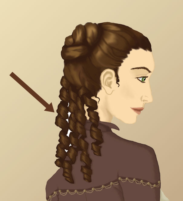
Once you think your drawing is finished, zoom in to at least 150% and check for gaps where the background isn’t filled in. This is often an issue after you’ve inserted a gradient backdrop. Sometimes little spaces get overlooked, such as between fingers or strands of hair. In the example below, I forgot about the spaces between the model’s ringlets when I added the background gradient. As a result, she has white gaps in her hair. The solution is to use the eyedropper to select the nearest background color, then use the paint bucket tool or a small paintbrush to fill in the missing color.
Detail From “Steampunk Trousers” ~ 2014
Mind the Gap
Finally, zoom in and examine the edges of your model. If you’ve added a backdrop behind the original image, there may be a halo around the edges of the model’s skin and clothing, where the colors don’t match. It might be a smooth, even halo, or it might be an occasional bump of mismatched color, jutting out from the edges of the model. Either way, the easiest way to fix it is to use the smudge tool to soften the edges, blending them together. Be careful, though! You don’t want to make the edges of your model blurry. You just want to smudge the colors against each other, so the halo disappears. Use a light touch and stroke inwards, dragging the background color against the skin or fabric.

Detail From “Think of Me” ~ 2014
White Halo
~~*~~
As you can see, it isn’t very difficult to add a background to your fashion sketches! Using the basic techniques you just learned, you can create a quick and easy gradient, or extremely detailed scenery. Have fun with it!
“Il Muto” ~ 2014
Pingback: Fashion Sketches: Adding a Digital Background | Yesterday's Thimble