
Color is a crucial element of artistic sewing and design, but it intimidates a lot of people. Which colors go together? How do you combine them for best effect? Once you understand the underlying principles, color becomes a valuable tool, rather than something to fear.
Let’s start with the basics.
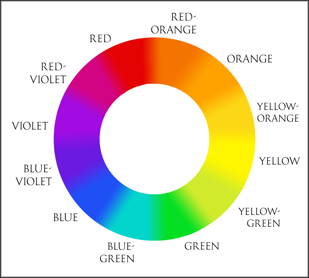
This is an artist’s color wheel, created by Sir Isaac Newton in the mid 17th century. It’s divided into twelve colors (also known as hues). However, since color is a spectrum, there’s no precise division between colors. It’s more of a gradual transition from one to the next.
Primary Colors
Red, yellow, and blue are the foundation of the artist’s color wheel. They’re known as primary colors and cannot be created by blending any other colors.
Secondary Colors
When you mix two primary colors together, you get a secondary color.
• Red + Blue = Violet
• Blue + Yellow = Green
• Yellow + Red = Orange
Tertiary Colors
When you mix a primary color with a secondary color, you get a tertiary color. These are easy to identify because their names are a combination of the two colors they’re made of.
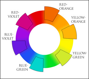
Some tertiary colors have custom names, as well. Blue-green is often called aqua, for example, and red-violet is also known as magenta.
Color Variables
By varying the value, contrast, and saturation, you create visual interest. Tints, tones, shades, and temperature are also important to be aware of.
- Value
A color’s value indicates how light or dark it is. High value colors (tints) are lighter, while low value colors (shades) are darker.

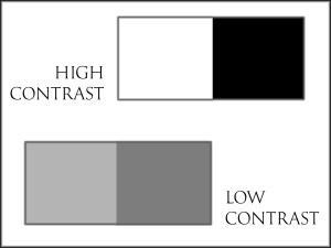
- Contrast
Contrast is the difference in value between two colors. High contrast means there’s a major difference, such as between black and white. Low contrast means the values are similar, like between subtle shades of gray.
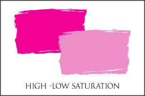
- Saturation
A color’s purity or intensity—how strong or weak it is—is its saturation. A clear, vivid fuschia is highly saturated, while a grayish-pink is low in saturation.
- Tint
Lighten or tint a color by adding white. This raises the value and may change its contrast with surrounding colors.

- Tone
Desaturate or tone a color by adding gray. This may also reduce its contrast with surrounding colors.

- Shade
Darken or shade a color by adding black. This lowers the value and may raise its contrast with surrounding colors.

- Temperature
Colors are perceived as being warm or cold. Typically, warm colors include red, orange, and yellow, with neutrals of beige and brown. Cool colors usually include violet, blue, and green, with neutrals of navy and gray.
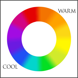
However, it’s important to note that color is a spectrum, therefore both warm and cool versions of every color exist. You can use this to help create unity.
Color Schemes
If you randomly mix and match colors in a sewing project, the results may be less than appealing. There are several tried-and-true ways of pairing colors harmoniously, ranging from mild to energetic. Whichever scheme you pick, don’t let the colors compete with each other. Choose one or two be dominant and use the others as accents. Also keep in mind the variables, as mentioned above.
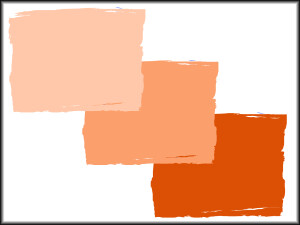
Monochromatic
Using tints and shades of the same color tends to be bland, but calming.
Analogous
Since they’re related, colors that are next to each other on the color wheel often look harmonious. It helps to add contrast by incorporating different values.
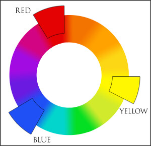
Triadic
Colors that are equally spaced around the color wheel look bold together. The most common grouping is the primaries (red, blue, and yellow), but any three colors will work if they’re equidistant. For a fresh look, try experimenting with value and saturation.
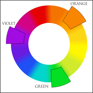
Complementary
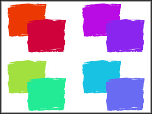
Two colors that are directly opposite on the color wheel will look vibrant and energetic. They can be fun, but also overwhelming if not used with caution.
The final two color schemes are more complex variations of the complementary scheme.
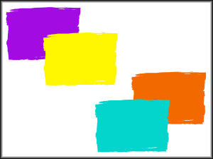
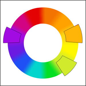
Split-Complementary
For a sophisticated and unexpected look, choose a color and find its complementary, then look at the two colors on either side. You can use either one or both.
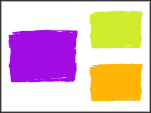
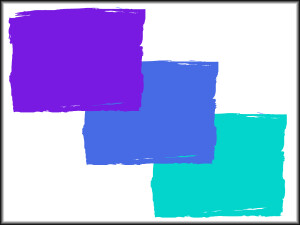
Complementary-Plus
To reduce the impact of a complementary scheme, pick two complementary colors, then add a third color that’s halfway between the two.
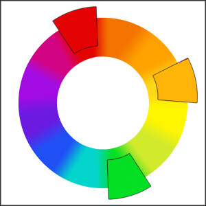
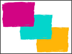
Here’s another example of complementary-plus. Don’t forget to play around with the variables!
Helpful Link: This Color Calculator will help you visualize different color schemes.
~~*~~
Looking for more? Check out our list of Articles and Tutorials, along with Sewing Basics.