

Welcome to my continuing series on drawing fashion sketches! In the first two articles, I showed you how to draw your own croquis, including techniques for posing, as well as drawing hair and features. (Croquis: Fashion Sketches, Part I & Part II.) Next, I demonstrated how to add color to your sketches. (Digital Color: Coloring Your Croquis, Part I & Part II.)
In addition, I’ve uploaded several tutorials to my deviantART account, including how to draw ringlets, corset lacing, fringe, and realistic eyes, among others.
Now, let’s explore something new—backgrounds!
(Click on any illustration to view the full-sized image.)
Tools
While it’s possible to add a background to any traditional drawing, this article will focus on digital painting. You’ll need a high-resolution scan of your drawing, along with a fairly sophisticated graphics program. I use Photoshop Elements, but there are others that will do the job, such as Adobe Illustrator or Paint Shop Pro. There are even some programs available for free! Just make sure it has the following features:
- Layers
- Magic Wand Tool
- Gradient Tool
- Smudge or Blur Tool
- Line Tool
- Eraser Tool
- Brush Tool
It’s much easier if you work with a graphics tablet and stylus, instead of a mouse, or a laptop’s touch-pad. A tablet allows you to draw with a natural motion, just like using a pen or pencil, which reduces strain on your neck and shoulder. A small entry-level tablet is good enough for most purposes and can be purchased for between $60 and $100, depending on which software package it includes. (Mine came with Photoshop Elements 11, plus a couple other drawing programs.)
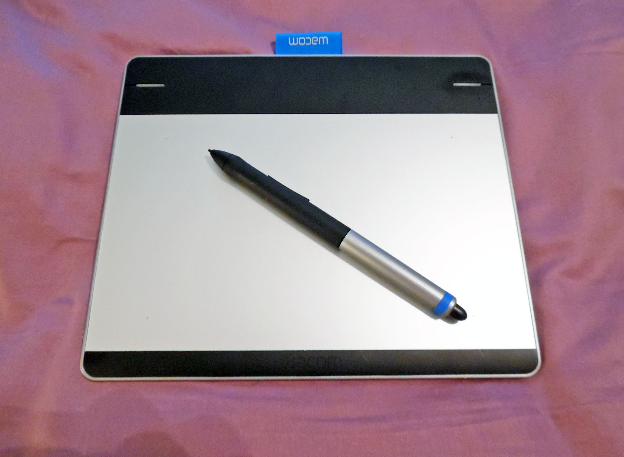
Wacom Intuos Graphics Tablet
The Importance of Backgrounds
Knowing how to add a background is useful for all kinds of artwork. Interestingly, not all fashion sketches have backgrounds. Some professional sketches center the model on a blank sheet of paper—which is fine, because the goal is to feature the clothing you’ve designed, not to display your art skills.
But sometimes it helps to have something behind your model, so she isn’t floating in white space—especially if you’re doing more of a portrait or casual sketch.
The background has a significant impact on your drawing as a whole. The color scheme and level of detail can amp your drawing up to whole new level of professionalism. It can also impact the mood of a sketch.
You can manipulate emotions by your use of color, so choose your color scheme wisely! In the example below, notice how the different backdrops change the entire feel of the drawing. The first sketch (left) has more energy, but it also feels a little uncomfortable. The second sketch (middle) is more relaxed, yet the ombré background adds a bit of interest. The third sketch (right) is serene and harmonious, but not quite as interesting. You can see, then, how important your color choices can be!
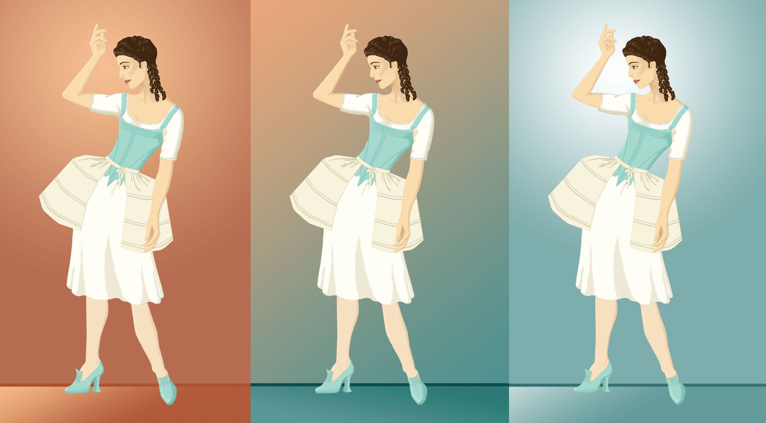
“Rococo Underpinnings” ~ 2014
Different Color Schemes
For this tutorial, we’re going to keep things fairly simple, but you’ll find plenty of tips and tricks.
Preparing the Background
It’s a good idea to consider the background an integral part of your drawing. The color scheme and mood should match your drawing, ensuring harmony. The best way to do this is to sketch in your background as you draw, not leaving it until the very end.
Sometimes, though, you don’t have time to do a detailed illustration. Or maybe you want to focus on getting the model and her clothing just right, without the distraction of scenery. If you already have a fashion sketch with a blank background, it’s relatively simple to add something behind the model.
There are a couple of ways you can prepare the sketch, but this is the method I find easiest.
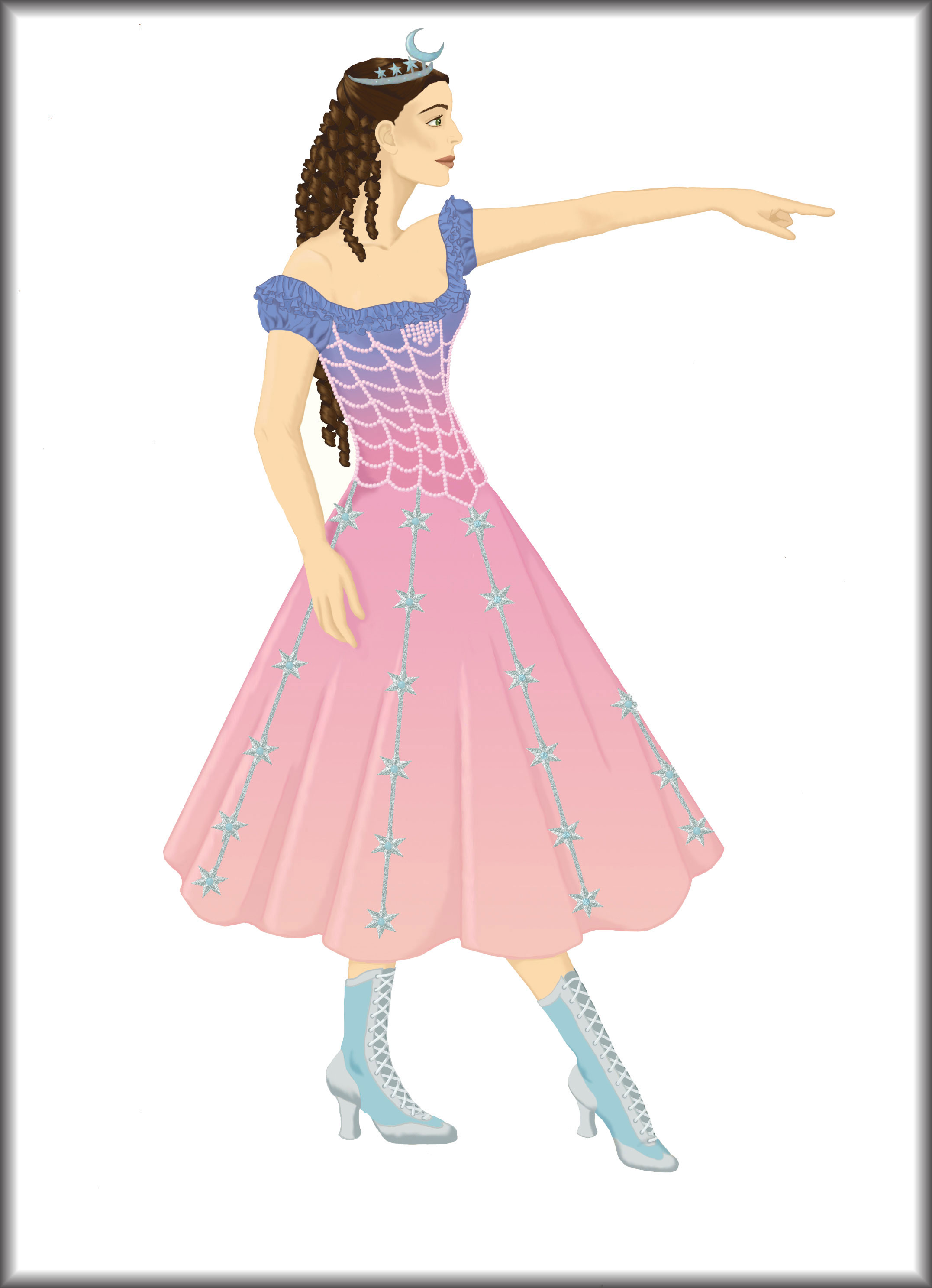
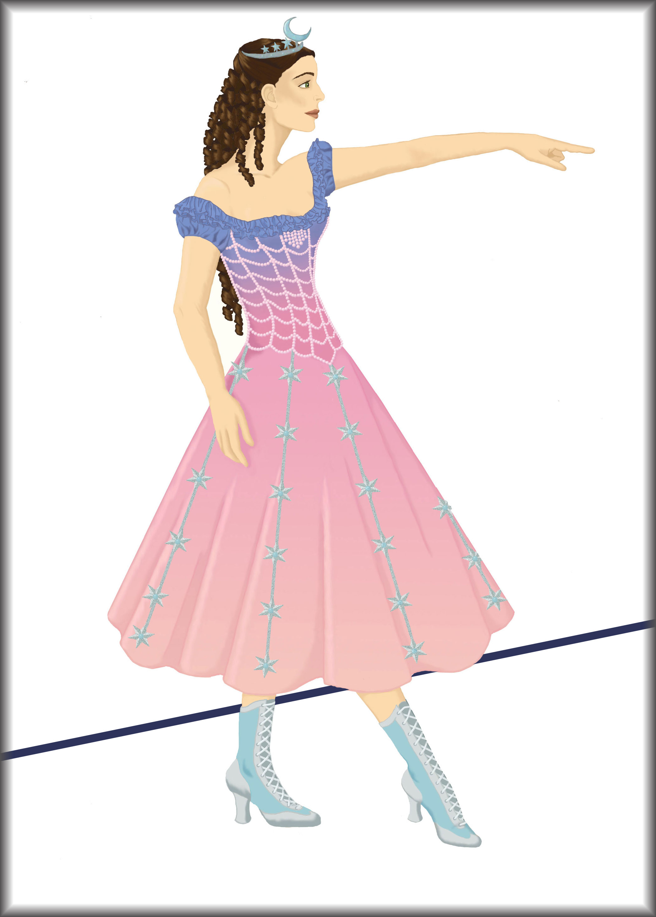
Use the magic wand tool to select the entire background. Don’t forget to select any gaps between the model’s arms and body, as well as between her shoes, fingers, and strands of hair, if applicable. (In the image below, some of these areas are highlighted in pink.)

“1952 Vintage Day Dress” ~ 2014
Highlighted Gaps
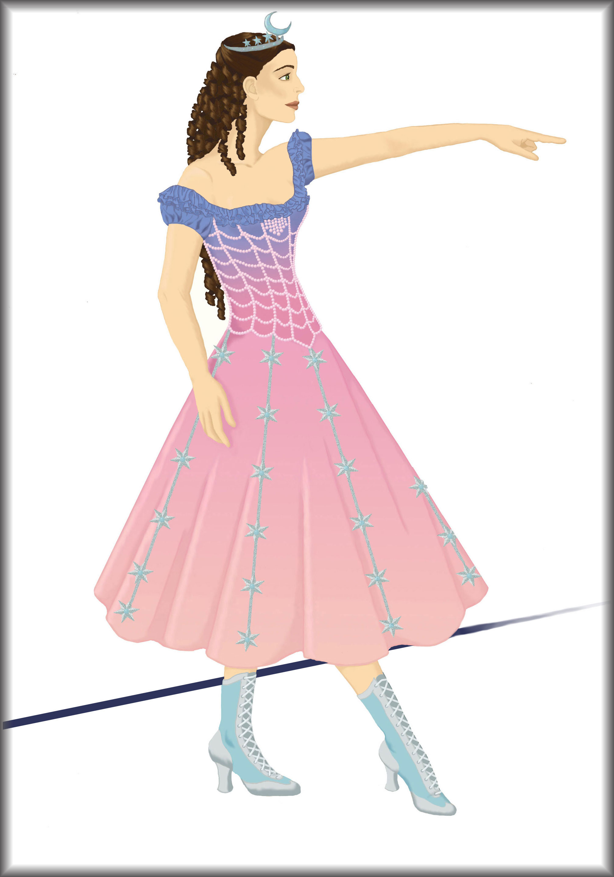
Change your background color to white and hit the Delete key. This will erase everything that’s selected, turning it white. If it accidentally deletes part of your drawing, hit CTRL-Z to undo your last action, then try changing the sensitivity of the selection tool. If that doesn’t work, you can manually paint or erase around the edges of your sketch, creating a definite boundary that the magic wand tool will recognize.
You should now have a completely white background that’s ready to be filled in.
Choosing the Level of Detail
It’s up to you to decide what level of detail is right for your drawing. Remember—your sketch is the focus, so don’t let the background take over. Here’s a list of different levels of detail you might choose from.
- No Background
- Grounding Line
- Solid Colored Backdrop
- Gradient Colored Backdrop
- Gradient Backdrop with a Grounding Line
- Vague Scenery
- Detailed Scenery
Let’s take a closer look at these options.
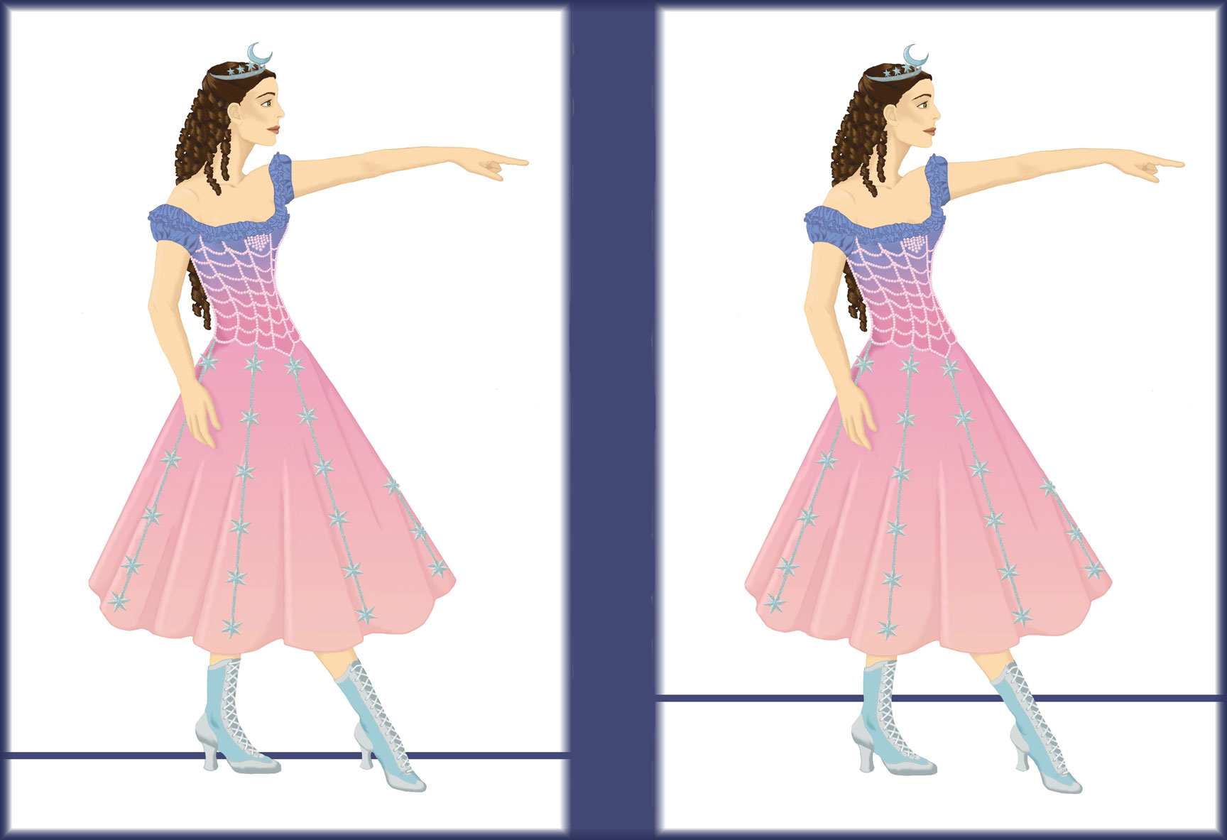
No Background
This is what you’d choose for a minimalist look. It’s literally nothing—just your model in front of a plain, white background. This technique requires no effort, but it can leave your drawing looking unfinished. Plus, any pale areas will appear washed out, since there’s no color contrast.
“Masquerade” ~ 2014
No Background
Grounding Line
A grounding line is a basic line representing the horizon behind your model. It adds a hint of depth to your drawing, but it’s not very detailed. If you want, you can try integrating your signature with the grounding line, as I did in the example below.

“Masquerade” ~ 2014
Grounding Line
To improve upon this technique, try shifting the line up a little, so it looks farther away. This gives the illusion of more space between your model and the horizon. Keep in mind the principles of perspective—when an object is far away, it becomes less defined and the colors become less saturated. If your grounding line is meant to be very far in the background, fade the color and blur the edges, just a little, to emphasize the distance.
“Masquerade” ~ 2014
Moving the Grounding Line
-
Tip
In many graphics programs, holding down the SHIFT key will automatically straighten the line as you place it. If you want your grounding line to be perfectly level, give this a try!
For a more dynamic look, tilt the grounding line. This causes the background to appear at an angle behind your model, which instantly adds depth and vibrancy to the image.
“Masquerade” ~ 2014
Tilting the Grounding Line
To add even more dimensionality, have the line fade into the distance—becoming narrower and blurrier as it recedes.
“Masquerade” ~ 2014
Fading the Grounding Line
When you add a line to any drawing in Photoshop Elements, it creates the line as a new layer. This is very useful, since it means you can erase parts of the line to make it appear as if it extends behind your model.
If you don’t have layers in your drawing program, you’ll need to draw the line right up to the model, then continue it on the other side of her body. Be careful! You have to make sure the line remains steady and straight across the drawing. When drawing two separate lines, it’s very easy to accidentally change the angle of the second line, so it no longer follows the same path. To double-check, after you’ve drawn both your grounding lines, draw a line across the entire image and compare it to your grounding lines to be sure they’re straight. Hit CTRL-Z to undo the new line once you’re done checking.
Solid Color Backdrop
For a slight improvement upon a plain white background, you can add a solid color. Play around with different hues and saturation levels to see what looks best. Definitely try a complimentary color—one that’s opposite on the color wheel. It can make your image pop! Just be careful that the color doesn’t wash your drawing out, or distract from the image.
In the example below, the first sketch (far left) has a dark gray background. It’s really too dark—you lose some of the detail on the shoes. The second background (middle left) is pale ecru, which has potential. In this case, however, it’s too light. You have to squint to see where the model’s skin begins. The third background (middle right) is a medium peachy-pink, which clashes with the green and rust-red of the fashion sketch. It’s too unsettling. The fourth (far right) is the one I would pick. It isn’t perfect, but the lavender-gray is complimentary and it has the right level of contrast—neither too dark or too light.
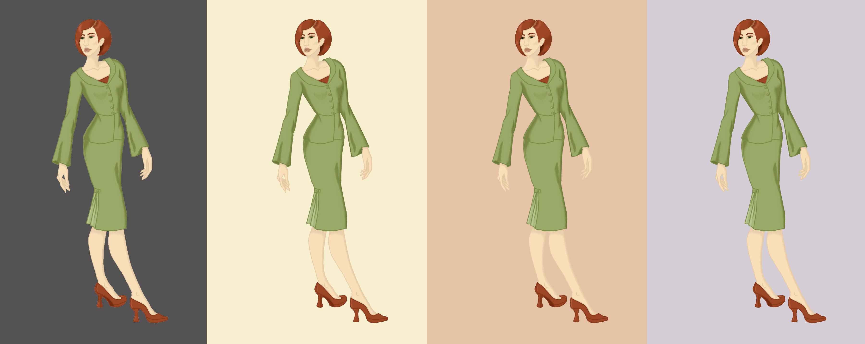
“Classy Suit” ~ 2013
Solid Color Backgrounds
To add a colored backdrop, select the background with the magic wand tool, then use the paint bucket to fill in the color. Zoom in and check the edges of the model and her clothing, just to be sure the color filled in smoothly, without leaving a halo. If there is a halo, use the paintbrush, eraser, or smudging tool to carefully smooth the edges.
~~*~~
In the second half of this article, we’ll continue onwards by learning about gradient backgrounds, vague backdrops, and detailed scenery.