by Lisha Vidler
(Click any illustration to view the full-sized image.)
In Croquis: Fashion Sketches, Part I and Part II, you learned how to draw fashion sketches. Now we’re taking a closer look at how to digitally color your drawings.
The five steps of coloring a croquis are:
- Outlining
- Color flatting
- Adding shadows
- Adding highlights
- Adding texture and details
In part one of this article, we discussed how to scan your drawing and clean it up, then we looked at the first step of coloring, which is outlining. Now we’ll fill in the color, place shadows and highlights, and add details, such as texture and reflections.
Step 2: Color Flatting
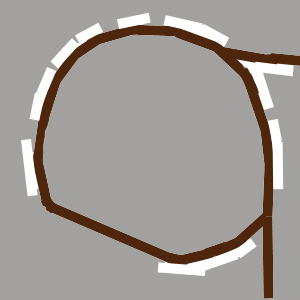
To fill in the main colors, you can either create a new layer that’s sandwiched between the background layer and the outline layer, or you can color directly on the background. The point is to work on a layer that’s beneath the outline layer, so your coloring won’t overlap the outline. The downside to this method is that the outline and all of the lines you drew to clean up the image are above the layer you’re coloring in. This means all of the invisible white lines will suddenly start appearing when you fill in the image with color.
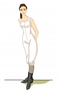
In the image below, I started with a white background and smoothed the edges of the sleeve outline, then filled in the background so you could see the visible marks that will appear once you start coloring.
The solution is to temporarily switch to the outline layer and color over the white spots to make them blend in with the rest of the drawing. Don’t forget to switch back to the other layer when you’re finished.
Remember to use a color that’s lighter than your outline. Select the paintbrush and choose a size that’s large enough for you to fill in the color quickly. If necessary, you can reduce the brush size in order to color small areas, such as fingers.
At this stage, don’t worry about details. If you need a certain area to be darker, such as to indicate wrinkles on a piece of clothing, you can paint those lines with a darker color. But don’t add shadows or highlights at this stage. Just fill in the basic colors of the model’s skin, hair, and clothing.
Step 3: Adding Shadows
To make your drawing more realistic and less like a cartoon, it needs shading. There are two types of shadows you can draw. The first kind forms wherever an object curves away from the light. The further away it is, the darker the object will be. The second kind is a cast shadow, which forms where an object blocks the light, thereby casting its shadow onto a nearby surface. An example would be the shadow on the ground cast by the model’s body.
To add shadows, first decide where your light source is coming from. I tend to put my light source at the upper left of the drawing, but your light can come from any direction. Place the shadows wherever they would naturally be, such as the underside of the model’s arms, the side of her neck and under her chin, and anywhere her body or clothing curves away from the light. Place cast shadows with caution, as they can easily overwhelm your drawing.
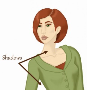
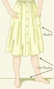
In the sketch above, you can see regular shadows on the side of the model’s neck, and cast shadows on the torso beneath her arm. In the sketch below, there are regular shadows on the model’s limbs and in the folds of the skirt, especially along the right side, which faces away from the light source. You can also see where the skirt casts a shadow onto her legs, as well as where her body casts a shadow onto the ground.
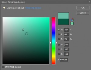
How do you choose what color to make your shadows? For regular shadows, use the eyedropper tool to select the main color you’re working with. Open the color picker and choose a color that’s both darker and more saturated. Generally, this means moving the cursor diagonally down and to the right.
For cast shadows, you can either do the same and pick a darker version of the color you’re already working with, or you can choose contrasting color that looks nice with your color scheme. For instance, if your model casts a shadow on the ground, you might pick grayish-green to contrast with the pink of her skin color. If your color palette is warm, you might choose a light brown for the cast shadow. If your palette is cool, consider a grayish-purple. Experiment with various colors until you find a combination that looks right to you.
You can draw your shadows with a small-sized paintbrush or you can use the line tool. Either way, when you’re done, you’ll need to use the smudge tool to blend the edges of the shadows. This creates a soft, blurred edge, instead of a sharply delineated one. Your shadows will look much more natural if they blend in.
Step 4: Adding Highlights
Highlights or reflections help give your image even more of a three-dimensional effect. They appear where the light hits, so you’ll need to remember where your light source originates.
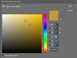
Generally speaking, you want your highlights to be lighter and less saturated than your main color, so do the opposite as you would when picking a shadow color. In the color picker, move the cursor diagonally up and to the left.
Draw your highlights as you would your shadows, either with the paintbrush or the line tool, but use them sparingly. Too many highlights will make your garment look as if it’s metallic. For the same reason, don’t go too light with the color. Keep highlights subtle.
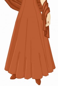
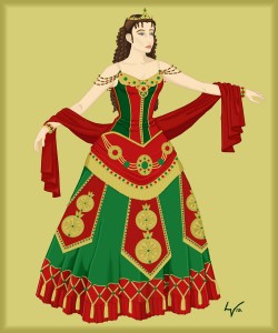
In the sketch below, you’ll see highlights where the light hits the edges of the skirt’s folds, as well as on the edges of the shawl.
When you’re done placing your highlights, use the smudge tool to blend the edges, just as you did with your shadows. This makes the highlights less stark and more natural-looking. If you have a hard time blending the edges, consider whether the color is too pale. If you think this is the problem, redo the highlights using a tint that’s closer to the main color, then try blending the edges again.
Step 5: Adding Details & Texture
The final step is to examine your drawing to see where it might benefit from adding detail or texture. Don’t go overboard with this. Sometimes a drawing is better off plain. Adding too many fiddly details can actually detract from the quality of your work, so only add what’s absolutely necessary.
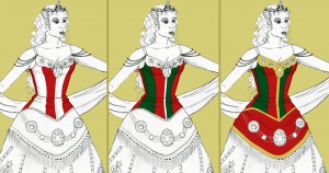
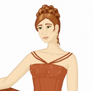
Where might you add detail? Suppose you have a gown with a sequin border. You could draw the sequins, then add small light flares to draw attention. Remember to keep light and shadow in mind. If your sequins are in a shadowed area, they probably aren’t going to sparkle.
To make the sparkling sequins in the above illustration, I first used the paintbrush to draw a small, dark circle. I placed a second, lighter circle over it, offset a little, so the darker circle became its shadow. Using a custom X-shaped brush and a much lighter color, I added crosses over a select few of the sequins, giving the illusion of sparkle.
If your costume has brocade, appliques, fringe, or anything three-dimensional that’s too small to actually draw, you can add texture to give the impression of detail. For example, look at these medallions that decorate the skirt of Elissa’s “Think of Me” costume, from Andrew Lloyd Webber’s The Phantom of the Opera. I selected the inner portion of each medallion and used Filter > Sketch > Reticulation to add a mottled texture.
To create realistic-looking fringe and tassels, I selected the area I wanted texturized, then clicked Filter > Texture > Texturizer. I chose a canvas texture, with the light coming from the right—and this resulted in what looks like fringe.
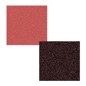
Photoshop Elements has dozens of filters you can play around with, so experiment and see what they do. Keep in mind that some filters use the active colors, so if you want a gold-textured design, you’ll need to make sure the color boxes are both set to shades of gold. In the example below, both squares started out the same shade of pink. For the top square, the foreground color was a dark pink, while the bottom square’s foreground color was black. I used Filter > Sketch > Reticulation on both squares, but as you can see, the difference in the active color made them turn out quite differently.
Be sure and check out the custom paintbrushes and custom shapes, too. You might be surprised at what’s in there!
Conclusion
While it takes diligent practice to get good at painting digitally, the results are worth the effort. Just remember the five steps of digital colorizing and you’ll be able to turn out beautifully colored croquis in no time!

