by Lisha Vidler
In this article, we’ve been looking at how you can design your own authentic historic costumes. In Part I, we examined how to narrow down your design ideas, how to create costume sketches, and how to mix and match historic design elements for a quick and easy—but not entirely original—costume. In Part II, we’re going to advance to creating a wholly original costume, using historic details as inspiration. To illustrate the design process, I will show the process involved in designing a ballgown from 1876.
Advanced Design
It begins with the basic silhouette. In 1876, the “Natural Form” style began to replace the prominent bustle. Skirts were typically trained during this time, and the fullness had begun to drop from the high puffed bustle to just below the knees. As time went on, it created a smooth sweep from waist to floor. Yet the transition was a slow one, so if you’re making something from this period, you can lean in either direction.
My gown will be made so that it can be worn either with or without a bustle, depending on which look I’m in the mood for.
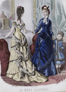
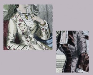
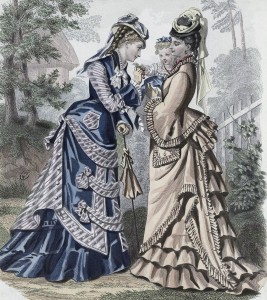
In searching for inspiration, I first found this fashion plate:
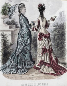
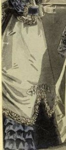
I loved the layers and swags across the train. I didn’t care much for the back of the bodice, and the image doesn’t show the rest of the gown, so I put it aside and let it simmer in the back of my mind. Sometime later, I came across another fashion plate which used a similar style of rear drapery.
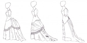
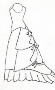
I finally decided to take the idea and play with it a little. First, I simplified the drapery. I liked the idea of the rear panels flipping to the sides, with the swags connecting them across the back of the gown, but I didn’t like the pleated layers. So I smoothed out the panels and reduced the tiers to two.
I couldn’t see the front or sides of the gown, so I made the decision to have the drapery end on the sides, rather than wrap around to the front. Exactly how it would work, I hadn’t figured out.
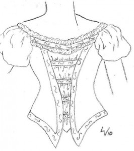
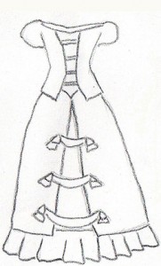
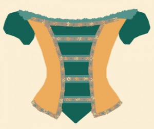
Next, I thought about making a coordinating bodice. I knew I wanted it to be a ballgown, which meant a low, wide neckline and small puffed sleeves. I sketched several styles, and finally decided to make the center of the bodice out of a contrasting fabric, with bands of trim that would connect down the center front of the bodice.
This two-tone style of bodice was common in the 1870s, and I’d also seen examples of “strapped” bodices, so I knew this could work together.
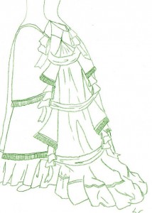
As for the overskirt, it proved difficult to find a design for the front and sides that would be compatible with the rear drapery. I wanted options to choose from, and so I sat down and started sketching. I could think of only one possibility that would work for the sides, based on commonly found side-draperies of the mid-1870s.
The front overskirt took longer to design, as I needed to strike a fine balance: I wanted the back to be the main feature of the gown, but I didn’t want the front to languish in obscurity. Though I came up with several possibilities, I didn’t particularly like any of them.
Eventually, I saw this fashion plate and decided something like it might work.
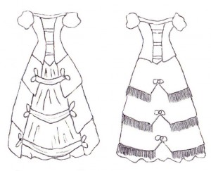
I adjusted it to better suit the lines of the gown and was satisfied.
The design looked like this for several months, until I began preparations to begin sewing. A limited amount of satin indicated the need to conserve fabric; I would have to use the historic method of piecing the skirt together, using inexpensive fabric for the parts that would be hidden beneath the overskirt. Since I wasn’t quite happy with the front of the gown, I took the opportunity to revisit the design.
Oftentimes, design follows necessity. In this case, it turned out for the better. After perusing my library of fashion plates, I found a style that would suit all my needs.
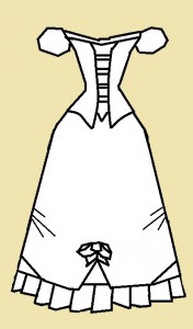
Instead of the split front, the overskirt would remain one piece, allowing me to replace the fabric beneath with something less expensive, and creating a simpler, more suitable line for the gown. It permitted the focus to remain on the rear drapery, which is what I’d wanted all along.
As a final step, I added a flounce along the bottom of the skirt. At first, I wanted a crisply pleated ruffle, but the sketches didn’t look quite right. It was too tailored, which didn’t fit with the rest of the ballgown’s style. I found an example of a gown with a gently ruffled flounce, and decided that would be much more becoming to the style of the gown.
With that decided, I stepped back and looked at the costume as a whole.
Balancing the Whole
The main feature of the gown is the cascading swags in the back. It’s important that the rest of the gown supports this design, without competing or overpowering it.
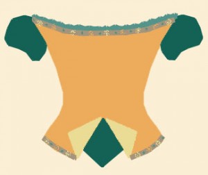
The back of the bodice is plain, so as not to attract attention away from the rear drapery. At the same time, it echoes the design of the overskirt, with the reveres. The swags are only partly visible from the side, so the side drapery coordinates and continues the design in a subdued way, not drawing attention away from the rest of the design. The front is subtly crafted, with a triangular notch and looped ribbon that’s reminiscent of the rear swags. The front of the bodice likewise echoes the design, using horizontal straps to pin the faux vest together. Looked at as a whole, the design is cohesive and balanced. It has an obvious focus, while the rest of the gown harmonizes, yet doesn’t compete.
Color as a Design Element
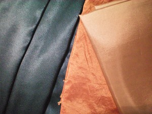
Color is another important feature of this gown. There are three colors used: copper, gold, and teal. The main fabric contains cross-woven gold and copper. The two accent colors are dark teal—which is almost complementary to the copper, meaning directly across the color wheel—and a champagne gold. The colors spark off each other, creating a bold alliance. With such temerarious colors, balance is crucial.
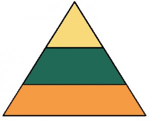
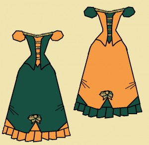
One color must be dominant, and yet not overpowering. The other colors must be displayed to their best advantage—not so little that they vanish under the presence of the main color, yet not so much that they battle for dominance. My intention is to create a pyramid of color. The main color is the foundation for the entire gown, placed on the bottom of the pyramid. Next is the secondary color, significant but used in less amounts. On top goes the accent color: vital, but used in small quantities. The result looks thus:
Make several pyramids using different color combinations, in order to settle on the three colors you like best.
When you’ve determined your color choices, play around to find your preference for which colors make up the foundation, secondary, and accent colors. Make a simple Paint sketch of the costume and save it on your computer. Use the “paint bucket” feature to fill in different colors, in order to find a suitable combination. Perhaps your gown would look more striking with the accent color as the foundation color! Experiment and see.
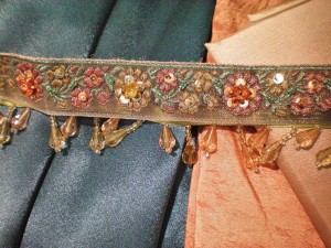
Next, coordinate your trim. Remember that the Victorians used copious amounts of decoration on their gowns, but they had a knack for keeping it tasteful. Find trims that will pick up all your colors, such as the beaded ribbon I found that contains green, copper, and gold, and the fringe of gold and green beads.
Once you’ve decided on the color scheme, you can make a final drawing of your costume. Make it large enough that you can easily refer to it while sewing. If necessary, draw closeups of the minute details of embellishments and trims and refer to it while constructing your costume.
Now, all that’s left is to find your fabric and trims, and start making your dream gown!
~~*~~
Have you designed an historic gown from scratch? What methods and techniques did you find useful? What would you do differently next time?

